
.png
)

“Design is not just what it looks like and feels like. Design is how it works” - Steve Jobs.

Heart is where the home is. The client requirement was simplified and they wanted to have a home that reflected their personalities at the same time gave the warmth and cosiness. The 1200 sq.ft. Apartment in Pune had to be designed following “form follows function”. This helped to evolve the design as the requirement was streamlined and utilitarian. The client need was not to have anything cosmetic that would make the house feel like a restaurant but like a home instead. These days’ designs tend incline towards a very superficial agenda. Hence we sat down with the client and broke down their requirement. After a basic necessity was in place we evolved the design from it. The apartment is 3 bedrooms, a large living space that spills over into a terrace. The open and airy character of the apartment was retained.

The entrance lobby is warm and welcoming; a floating console and a multi-faceted mirror over it create a striking impression. Subtle wallpaper was selected with hints of colour and gold hues for the background of the mirror. The main entry door was fabricated and cladded with ply and finished in laminate. Voids are created between mild steel bars finished in graphite colour and the ply cladded panels; giving a glimpse of the entrance lobby from outside. A solid wooden panel makes one side of the entrance lobby; this panel has the main entry door flushed; thus making this panel monolithic and gives the lobby a full height. The door within the panel is flushed with the panel and seamless. The ornate brass handle enhances the wood of the panel.

On entering is a long passage that leads to the living room. Due to the length of the wall it made the space look long and horizontal. To cut this plane we added vertical panels that not only accentuates the height but also breaks it horizontally. The client plays tabla (a musical instrument) that he wanted to display; we made these panels into a display place for the tabla. The other panel became a part of the TV unit. Each of the panels had a ledge that made it pragmatic at the end.


A wooden centre table has also been kept minimal utilitarian. A contrasting black hanging light above the corner table adds a light touch of opulence. The hanging light has black finish from outside and a muted gold finish from inside; the fitting throws a nice warm light in the corner. The soft furnishing was handpicked to have subtle hints of this gold; you can see these in the throw cushions, curtains. Smaller details were paid attention into, like picking the shear of the living room with delicate champagne gold embroidery against the contrasting raw silk blue main curtain. The carpet adds texture to the living room and just enough vibrancy that is needed in the midst of all the neutrality. The trio that completes the seating in the living room is an white upholstered bench with stitching pattern and a very low back. The wallpaper in the background of the bench has a subtle organic print; the two artwork above the bench add character to this area; art with a modern twist the frames have animal print in gold on a white background.
The layout of the apartment is such that it was challenging to create a cohesive flow from the living room to the dining and then the kitchen. Neither had to overpower the other yet merge well to accentuate the other. The living room also spills over into the terrace. We have two different types of flooring in the terrace; one part is the artificial turf and the other is wooden decking flooring. A palm tree has been lit to be the focus in the terrace. A comfortable chair set with a table is arranged on the turf; a wooden panel done is Shera sheet forms the background of this portion lit by floor washers. The living room converges into the dining space. Therefore we retained the materials used in the living for the dining space; to make the transition of the space smooth. The upholstery fabric matches from the living room. The dining table base is unique and angular; made of solid wood looks elegant with the glass top. A fixed seat was proposed towards the wall in the dining.

This fixed seat with a tall backrest is a very unique feature in the dining space. The backrest is finished in the same fabric as that of the sofa; however a chesterfield type of stitching with the buttons and pinches drastically changes the look of the same material. Design is not just for visual purpose it also matters if its application is also right. The backrest was one such element that not only serves the purpose but also adds couture to this design approach. In the overall residence the soft furnishing selection played a major role in giving some much needed depth in all elements. This further highlights the design.
In the existing layout of the house on
entering a wash basin was visible. It was crucial to beautify this and turn it
into being the focal point and not the eye sore it was. We picked beautiful
designer tiles that went well with the Travertine tiles we have used for the
flooring in the living room. The flooring tiles run along the length of the
passage from the entrance and turn around on the hall at this wash basin wall.
The designer high lighter tiles have been used on the sides to frame the
mirror. Copper caged hanging decorative lights have been used on either side of
the mirror. These caged lights are similar to the geometry of the tiles.
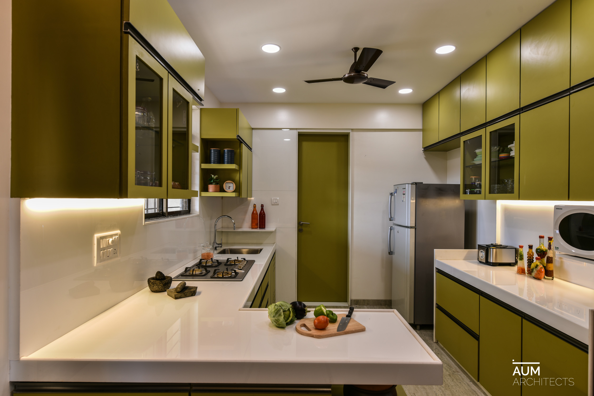
The dining space opens into the kitchen. It
was the most important to have a very unique kitchen that was aesthetically
fulfilling and utilitarian. The use of neutral shades in the living room and
dining gave balance in using a vibrant olive green laminate in the kitchen. The
white top in the kitchen with the green laminate is elegant and unique.
Graphite colour profile handles were used in the kitchen. The simplicity in the
material usage in kitchen makes it elegant. The glimpse of the kitchen from the
dining is a beautiful composition. We have combined the lighting to be a mix of
sharp ambient focus lights in yellow and more generic daylight lighting. This helps creating a character to the
liveable space.
The family consists of the couple and their
two grown up children. Each of the bedrooms and their subsequent bathrooms has
been done in a way to complement its user. The daughter's bedroom has elegance
of an English style but with a modern twist. A light colour wood finish was
selected for the overall room. Even though this was a smallest of the bedrooms
and we have used the wooden finish extensively; the colour chosen did not make
it heavy. A unique bed headboard with
ply panelling and flat mild steel plates with a small cushioned backrest.
Ceramic 3D floral motifs fixed on the headboard accentuate this simple panel. A
floral print was selected for the curtain in the room to add playfulness. An
emerald green finished off beat side table was customised to compliment the
colours in the room. The daughters attached bathroom has a unique wash basin
with a blue inside and a terracotta finish from the out. Subtle beige coloured
tiles and complimentary highlighter tiles with hints of the blue colour.
The son’s room was to reflect a musical theme
and at the same time have a very crude and industrial feel to it. An avid
reader, he also wanted same seating space with a book rack. We created this cosy
corner for him in the niche that was meant to have the wardrobe. we also made
that wall a feature wall where his guitar is displayed. The colour palette was
kept earthy and the crudeness was added and made visual. A wooden panel with a
brick wallpaper as the background frames the guitar. A book unit was wrapped
around the column and flows from the wall panel. The wardrobe was designed to
have handles camouflaged into the shutters and not those typical ready handles.
The fixed seat of the seating area in the niche and the headboard is finished
in a dual shade maroon colour for the son’s room. A concrete finish hanging
light was picked for the room over the side table. Adjacent to the light are two customised
pictures echoing the rock and roll theme in the room. The son’s bathroom is a
black bathroom finished in textured tiles; the contrast is created by the
sanitary fittings and the white counter top that are smooth and glossy. The
contrast of rough black against the glossy white creates an interesting
character. We have used sharp focus lights in the bathroom.

The master bedroom has been designed for
comfort. A full height cushioned headboard finished in velvet. The TV unit made
extends to become the dressing unit. The dark wooden flooring makes for a stark
contrasting base. The wardrobe handles were customised on site finished in
cream coloured Duco paint. A unique side table was made finished in the same
cream colour. Hence we too played with the soft furnishings, floral design in
pastel shades and a vibrant pastel shade sheer. The master bathroom is done by
in a monotone. The floor has been kept matt and the walls glossy in the same
brown colour. A niche has been made and ceramic floating koi fishes decorate
the niche instead of a typical art.
Carrying through desire of inherent
spaciousness this apartment after designing retains its character. Thus helping
us achieves the aim of keeping it clutter free and making it non cosmetic. Each
room has a distinct style and different incarnations of subtle modernity.
Making the space livable and also aesthetically pleasing.
|
PRINCIPAL DETAIL |
|
FACT BOX |
|
|
PRINCIPAL
ARCHITECT |
AR. MANISH
DIKSHIT |
BUILD AREA |
|
|
CIVIL
CONTRACTOR |
MANJU
ENTERPRISES |
SITE AREA |
1228 Sq.
ft. |
|
CLIENT |
|
DESIGN
TEAM |
SONALI
PANDIT, NACHIKET BORWAKE |
|
LOCATION |
PUNE |
LANDSCAPE
CONSULTANT |
|
|
PRINCIPAL
DETAIL |
|
YEAR OF
COMPLETION |
2017 |
|
PRINCIPAL
DESIGNER |
|
PROJECT
COST |
|
|
CARPENTRY |
AMAR
INTERIOR DECORATORS |
PHOTOGRAPHY |
PRASHANT
BHAT |
|
STRUCTURAL
CONSULTANT |
|
TARGETED
OVER TO FIT-OUTS |
|
|
LANDSCAPE
CONSULTANT |
|
|
|
|
PROJECT
NAME |
A-302 |
|
|
|
MECHANICAL
& |
|
|
|
|
FAÇADE
ENGINEERING |
|
|
|
|
CONTRACTORS |
|
|
|